I discovered the paintings of
Hurvin Anderson today via the new Saatchi exhibit/book,
Newspeak: British Art Now. The paintings are loud, energy filled hair-salon spaces occupied by a figure or "sitter". And before I could dismiss them and turn the page (as a large survey containing so much information overwhelms me to do: dismiss, dismiss - what's next, etc) I realized I loved them. These are paintings about paint.
Anderson's paintings reminded me of what attracts me most to certain paintings right now: tricking me into looking at something rather banal or usual in a new way with paint. Hi paintings are of figurative subject matter done in a very abstract way. You can follow a figurative or recognizable form - a room, a chair, counter top, towel - and follow it until it becomes an unrecognizable shape altogether: a mark.
Why is this so interesting? Because no matter how literal or
real an image, paintings are made with abstract marks. I think it's really strong when a painter can articulate a completely recognizable form with such loud marks. Not just marks for noise sake (as that's a lazy thing) but marks that become as important to the figurative space as the objects they exist next to in the same plane. When those shapes and swatches become as exciting as the forms rendered, if not
more exciting.
I started making comparisons to other paintings I remembered - that maybe at first I could not identify why they were so important to me. I thought of Matthias Weischer, who I first saw at the
Life After Death: New Leipzig Paintings from the Rubell Family Collection. That was also the first opportunity I had to see a Neo Rauch, in all his impressiveness, first hand.
In fact, I think it was Neo Rauch's work that first set these thoughts in motion. I never much grasped the surreal subject matter. I gravitated towards the ordinary things depicted in those wild canvases - the grubby hands, the motherly touch on a back - the way the painting was constructed. He is always playing with one color against another. One figurative form planted against something completely abstract. A face articulated in a messy mark.
Many years before that, I was impressed with Dana Schutz's neon palette (which never compares in reproductions). In one of her paintings of the fictional character, Frank, his chest becomes just the only gray-ochre flat shape in the painting - an abstract shape taking the same tone and shape as that slump of the chest. Wispy no-no paint marks become grass. In other paintings of hers, like
Lovers, these wild strokes of forest green become leaves, camouflage even, for two lovers who share a foot - and a kiss.
I am reminded also of the painter
Les Rogers, whose newer works tend to depict figurative spaces but then lead you to the splatter of a mark all in one shape.
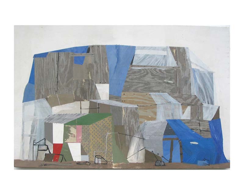
Working in an entirely different direction, but with a similar language is the Northwest artist Whiting Tennis. He uses collaged pattern as marks in his paintings.
Bitter Lake Compound in the Portland Art Museum is a good example of this.
 |
| Study for Blue Hamburger 2007 Whiting Tennis (via Greg Kucera) |
 |
| Frank in the Dessert 2002 Dana Shutz (via Saatchi) |
And even more local is the Portland-based, Grant Hottle. I first saw his work a couple months ago at Half/Dozen gallery at the Lofts. I didn't much like them at first. But then saw the
photo-only studio visit by OpenWidePDX. I sometimes thought the unfinished works lining the studio were more interesting, with flat colors swallowing otherwise fully formed spaces.
Almost any painting seems like it could be identified this way. But I find it especially exciting when a figurative subject can be articulated in this abstract way. What seeing Anderson's paintings made me realize is that I'm only figuring this out myself. After undergrad and years afterward hammering the same ideas home, I've only begun to figuring out that I never was looking at the figurative pieces of a subject...but the shapes, forms and colors.


No comments:
Post a Comment